I am constantly getting queried by clients on what to wear in your family portraits, so I thought that a handy dandy blog post on the subject matter was required! I promise you are not the only head of household stressed by the daunting task of trying to figure out what to pack for your family vacation portrait session. It’s not that hard when you break it down simply!
I think that capturing family portraits, especially if you’re on vacation in Lake Tahoe is incredibly important: from getting a jump on your holiday cards to wall art, family portraits are a visual representation of the love, connection, and memories that your family has made over the years. I’m here to tell you though – there is no perfect outfit and you shouldn’t let that be the thing that deters you from capturing your family. So, without further adieu, here are my tips that I hope will simplify your stress: what to wear in your family portraits, updated for 2023.


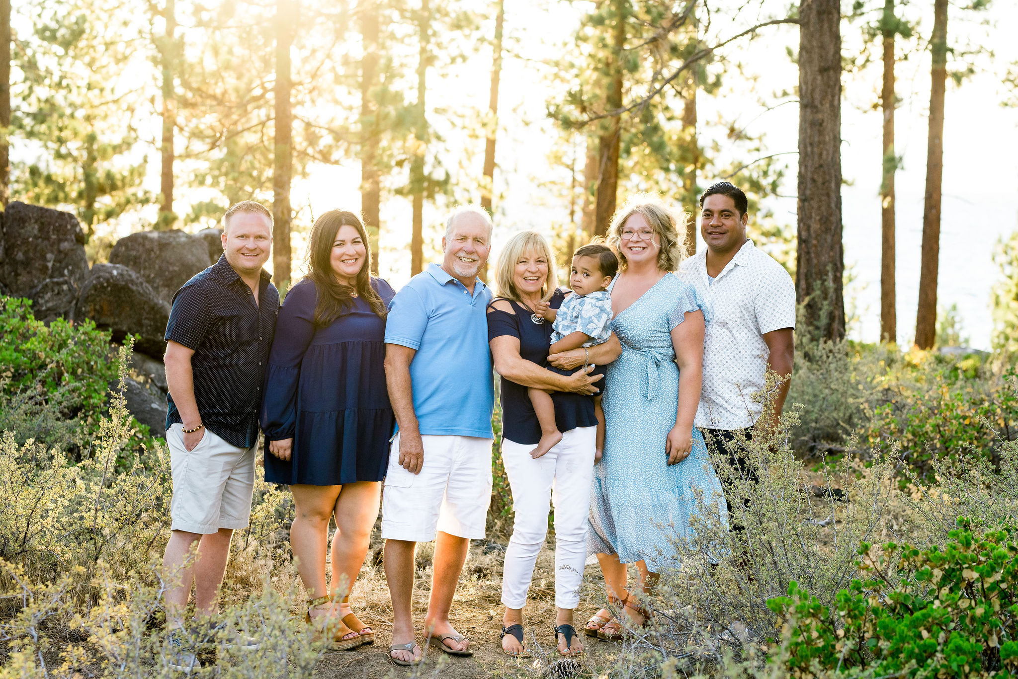
1. You want to pick coordinating colors, but not matching!
For family portraits, coordinating colors can make a big difference in the overall look and cohesiveness of your photos – instead of wearing matching outfits, opt for complementary colors that create a harmonious and cohesive look. I always recommend that it’s best if you pick 3 coordinating colors such as two brights and a neutral to work with so that everyone is coordinated but not too matchy-matchy. This color wheel tool is a great way to choose complimentary coordinating base colors.
Still stuck? Consider the location and season of your photoshoot when selecting colors. For example, if you are having a beach photoshoot in the summer, or a garden photoshoot in the spring, you might want to go for light and airy colors like pastels or neutrals. In the fall, warm earth tones like deep reds, oranges, and browns can create a feeling of coziness. In general the rule of thumb is that you should avoid overly busy patterns or clashing colors – they can distract from the overall aesthetic.


2. Use your accessories to add pops of your colors.
Need some visual interest but you have some family members who are a little bit more subdued than the rest of you? With two primary colors and one neutral, you can mix and match your colors as much as you want. That way, if someone in your family tends to dress more conservatively, or only in neutrals most of the time, they can still dress without bright colors and bring in that pop of coordinating color through their accessories, like scarves, statement necklaces, hats, jackets, sweaters or belts. This way you can add texture, color, and personality to your photos without being overwhelming.


3. Still stuck? Consider placement.
Can’t decide what to wear in your family portraits, but you know that you have a place you want that photo to hang? If you filling space on one of your walls with a print from your session, then consider the colors in your home (which are probably the ones that make you happy) when picking your clothing color scheme. If you love your orange and turquoise living room, then start there! If you’re a family of Aggies, don’t be hesitant to show off your colors!


4. Jewel tones work great but stay away from greens
Taking photos in the Tahoe forest? Don’t blend in! Greens don’t always pop very well against our all-green forest, but other jewel tones like dark blues, golds, and plums, look great! That being said, if you’re going to wear green, make sure you do it right: go very light or with a really dark olive so that you’ll stand out against the backdrop of our forest.


5. Limit patterns, logos and branding.
Say no to anything with big logos or branding and limit patterns, especially on adults. Patterns often tend to read too busy on adults and they can be distracting in your photos. That being said, small children in patterns is a great choice to compliment your color scheme! It adds a mini-dose of fun to any portrait. If you are interested in a pattern, stick with simple patterns like stripes or small floral prints. These can add visual interest without overpowering the photos. Don’t forget: the goal is to capture the connection and love among your family members. I promise that you’ll show everyone off best if you keep the clothing simple and timeless.


6. All white or all black: just say no.
All white? Sends you straight back to the 90s yo! This isn’t a Florida beach photo.
While black and white are classic colors that can look great in certain settings, wearing all black or all white outfits in family portraits can be too stark, lacks visual interest, and dates your images. If you want black or white included, incorporate these colors as accents or pair them with other complementary colors. For example, pair a black blazer with a bright colorful blouse, or a white dress with a denim jacket. That way you’ll add depth and dimension, keeping the photos engaging and not in a way that gets them plastered on a what-not-to-wear Pinterest board.


7. Keep it classy, San Diego.
Stay away from trends and hip current fashion. Keep it classy and classic – especially when it comes to high school senior portraits. It will prevent your photos from looking dated in a few years. I also think it’s important to stay true to your family’s style and personality: these images are a reflection of you and your family’s vibe. If your family is casual and relaxed, maybe suits are a really terrible idea. The key is to strike a balance between coordination and individuality, but in a way that doesn’t leave you wanting to take that photo off the wall in 5 years.


If you’re planning a summer vacation to Tahoe and are ready to refresh your family photos with a portrait session on the lake, don’t forget my number one tip: make sure you get trip insurance. If you’ve booked that session and want to make sure that you have a stress-free portrait session, I’ve got you covered!


Leave A Comment